Challenges of Color Calibration
Apr 12, 2020
Hello dear reader,
Are you even out there?
This blog post is later than the other ones have been. But I do have an excuse. I have been relentlessly working on a manuscript and finally submitted it on 04/07/2020 (!!). That article will doubtlessly make an appearance here at some point as I start to move away from image analysis stuff… maybe…
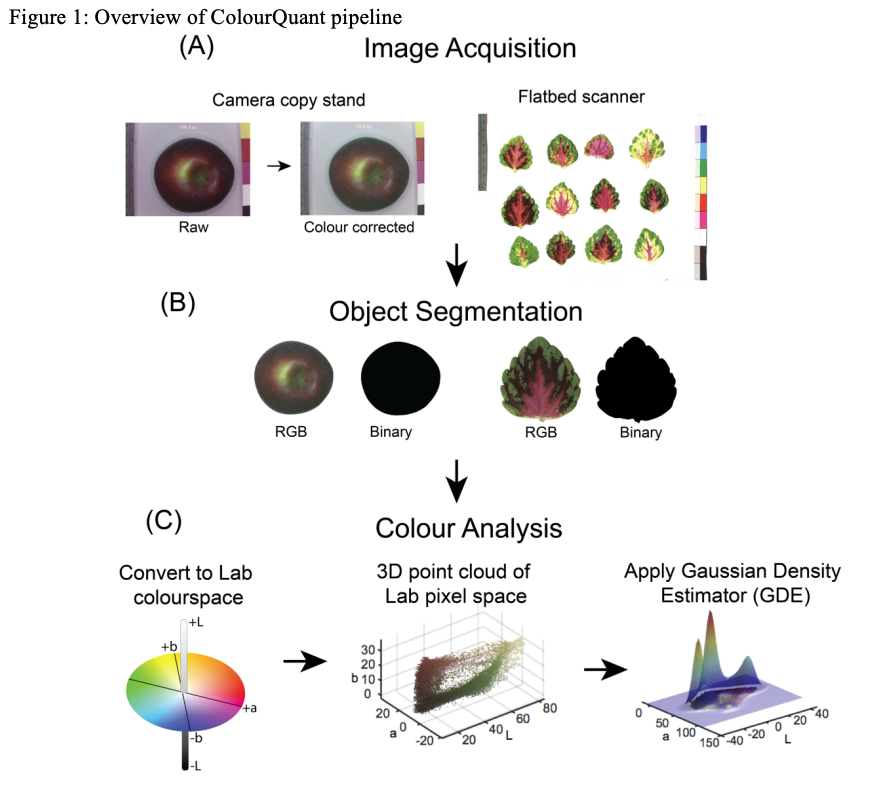
However, there is still much to cover. Today, I am going to let my fingers do the talking and comment on Berry et al “An automated, high-throughput method for standardizing image color profiles to improve image-based plant phenotyping.” PeerJ. 2018. (10.7717/peerj.5727). This paper is pretty nice and touches on a lot of problems related to color calibration that are really the focus of this blog, and not the article itself.
There are two general procedures that are used to adjust the color in an image:
(1) White, Gray, Black balancing (ColourQuant: https://arxiv.org/pdf/1903.01652.pdf)
(2) Color checkers (10.3390/s120607063 )
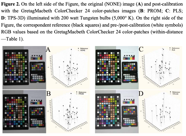
and (10.7717/peerj.5727)
For each of these, there are numerous specific procedures and I will not spend time digesting and regurgitating their dark and dirty details to you now. Check out the reference list for Berry et al and you will get a glimpse at this. Effectively, both rely on either a reference panels of some sort; gray scale cards or color checkers.
Color is so much more challenging that geometry. Previously, I discussed CASS which can be used to calibrate the geometry in an image, given some prior thought. To date, I am not aware of a equivalent color-calibrate procedure. But, you can imagine that the same problems persist with color detail due to distortion as does geometry. Sadly, color reproduction can be variable in the scene because of many factors, including the lens, lighting/illuminance, reflectivity, position in the scene, etc.
Lenses are made of glass, mirrors, and other moving parts (unless mirrorless) and focus light onto a sensor. Different parts of the lens focus light more accurately or less accurately relative to other parts of the lens, this results in both geometric and radiometric(?) ocular distortion. Light bends differently because of the physical properties of the lens and colors may appear more-or-less accurate because of those. DIstortion is continuously variable throughout the image. So, right out of the box, given perfect lighting and uniform illuminance, the color accuracy needs to be calibrated for every pixel and applying a single, fixed transformation to every pixel will simply maintain any relative distortion. However, the lens is a fixed, static source of continuous distortion that should be systematic, non-random, and addressable.
One could imagine a solution similar to CASS for color calibration using multiple color checkers.
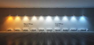
The light environment is critical. Outside vs inside, fluorescent vs incandescent, high wattage vs low wattage, focused vs scattered (diffuse), … and the list goes on an on… Given indoor environments, which bulbs and in which fixtures are most appropriate for accurate color reproduction? Imagine using a bulb that has a very “blue”-white hue. This is going to exacerbate the blues that your camera “sees” and likely blow them out of proportion to the reds and greens. Red and Greens will absorb more of this hypothetical blue light and appear more muted, while the blue areas will reflect more and appear more vibrant.
Hopefully, someone can tell me the best light bulbs that produce “true neutral” white light.
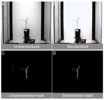
The illuminance uniformity is absolutely essential. Uniformity is also incredibly challenging to obtain. Basically, the uniformity is a function of who reflective a surface is and how focused a light source is. Shadows and light spots diminish the color information in those regions (you cannot estimate the color of pixels that are blown out [i.e., false white]). Shadows are problematic for the opposite reason. One way to think of this is – can you look at a picture and tell where the light source is? Are there shadows? Are there intense bright spots? As the focus of the light source goes up, the surface must be more and more absorbent (less reflective) in order to not get a light spot. As the diffusion of the light source increases, a surface can be more reflective and still not produce any bright spots. In my experience, even large bulbs filtered through white sheets can produce light spots on the surface of a strawberry (slight reflective and glossy) such that you can image where the light source is positioned.
This challenge is tackled best by putting diffusion material in front of the light bulbs.
However, we have to keep in mind that the diffusion material must also be “true neutral” otherwise the color accuracy will be diminished even if the bulbs are perfect. The type of light fixture that you choose will impact your ability to get a light bulb to appear diffuse or not. If the aperature of the fixture is small, then the light will appear more focuses but totally unenclosed lighting is hard to “control” and you really don’t need 360º of light. Turning the lights away from the target into a reflective white surface can help to generate diffuse light as well, blah…
Basically, my point is that perfection is almost unobtainable. What we need to do is recognize that in all circumstances we are comparing apples and oranges if the environment or camera changes. So, we need to standardize as much as possible and then be honest that all of our comparisons are relative and not absolute.
Best, Mitchell